Heatmap Chart in JavaScript: How to Build One (With Code Examples)
A heatmap is a table that paints. Here's how I build a heatmap chart in JavaScript: SVG cells, a color scale, a calendar grid, and the libraries I'd reach for next.
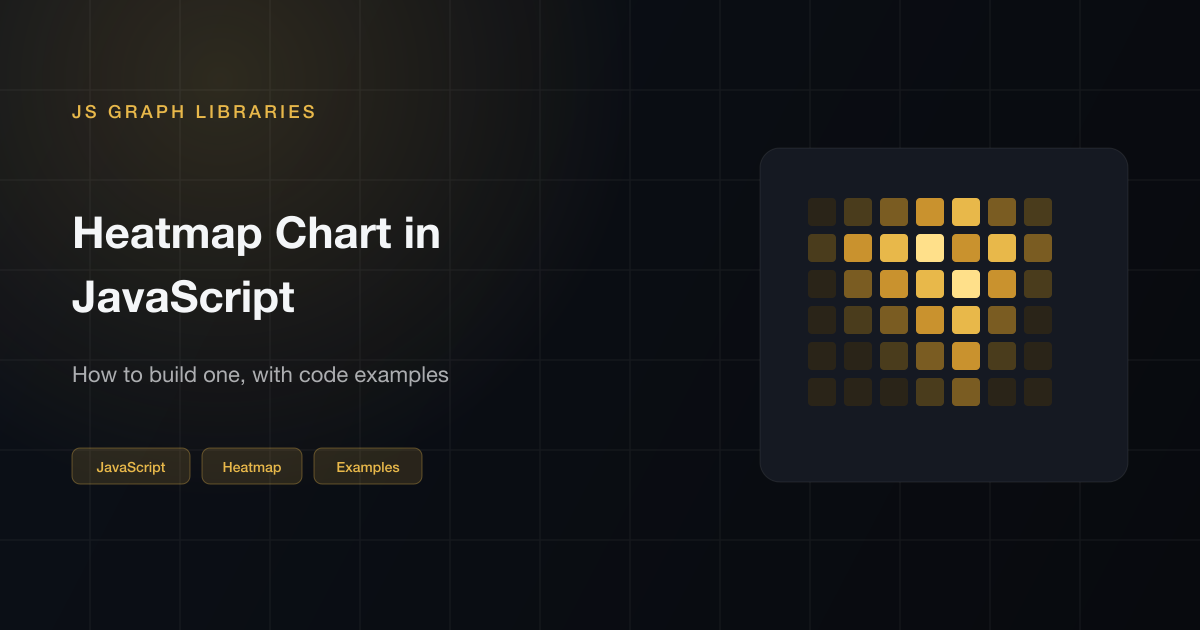
A heatmap chart in JavaScript is basically a table that paints cells instead of writing numbers. Two axes, one value per cell, and color carries the meaning. I reach for this when I have two category dimensions and a grouped bar chart would turn into an unreadable fence — hours vs days, features vs cohorts, a correlation matrix.
Below: a weekday-by-hour matrix and a calendar grid, both in plain SVG with no library. Then the same idea in D3 and Plotly if you're already working in one of those. If you actually need a map where geography determines the shapes, that's a choropleth: D3 map visualization. The rest of the type catalog is in JavaScript chart examples.
What a heatmap is
Each cell is a pair. Row is one category, column is the other, fill is the number. You compare by scanning for the hot patch, not by reading 84 labels. That's the whole point. If you only have one category, use a bar chart.
Two shapes show up in the wild: a matrix (this hour, this day) and a calendar (this date). Same encoding. Different packing.
Matrix heatmap
Dummy traffic, Monday through Sunday, 9 to 17. Midweek afternoon is supposed to glow. Weekend is supposed to go dark. Hover a cell for the count. The numbers are fake. The scale is the part I'd copy.
Preview
Calendar heatmap
GitHub's contribution graph is this: weeks across, days down, one square per date. I draw it when the x-axis is time and I care about the pattern in a year, not the exact Tuesday. Sixteen weeks of dummy “commits” below.
Preview
How to build one
Nested loops. A max. A function that turns 0–1 into a fill. Rectangles. That's a heatmap chart in JavaScript without a library. The live matrix is this, plus labels, a legend, and a hover box.
SVG
const days = ["Mon", "Tue", "Wed"];
const hours = [9, 10, 11, 12];
const values = [
  [12, 40, 62, 28],
  [18, 55, 80, 33],
  [6, 14, 22, 9],
];

const max = 80;
const cell = 28;
const svg = document.createElementNS("http://www.w3.org/2000/svg", "svg");
svg.setAttribute("viewBox", "0 0 220 140");

function color(t) {
  const x = Math.max(0, Math.min(1, t));
  const r = Math.round(42 + (232 - 42) * x);
  const g = Math.round(36 + (184 - 36) * x);
  const b = Math.round(24 + (74 - 24) * x);
  return `rgb(${r}, ${g}, ${b})`;
}

values.forEach((row, y) => {
  row.forEach((value, x) => {
    const rect = document.createElementNS("http://www.w3.org/2000/svg", "rect");
    rect.setAttribute("x", 40 + x * 32);
    rect.setAttribute("y", 16 + y * 32);
    rect.setAttribute("width", cell);
    rect.setAttribute("height", cell);
    rect.setAttribute("rx", "4");
    rect.setAttribute("fill", color(value / max));
    svg.appendChild(rect);
  });
});

document.querySelector("#chart").appendChild(svg);
If the page is already D3, scaleBand on both axes and
scaleSequential for the fill. Same cells, less arithmetic.
D3
const data = [
  { day: "Mon", hour: 9, value: 12 },
  { day: "Mon", hour: 10, value: 40 },
  { day: "Tue", hour: 9, value: 18 },
];

const color = d3.scaleSequential(d3.interpolateYlOrBr)
  .domain([0, d3.max(data, (d) => d.value)]);

svg.selectAll("rect")
  .data(data)
  .join("rect")
  .attr("x", (d) => x(d.hour))
  .attr("y", (d) => y(d.day))
  .attr("width", x.bandwidth())
  .attr("height", y.bandwidth())
  .attr("fill", (d) => color(d.value));
If I'd rather not draw the grid,
Plotly.js takes a 2D array and a
type: "heatmap". That's the ten-line version. There's a
live one on the Plotly page.
Plotly
Plotly.newPlot("chart", [{
  z: [
    [12, 40, 62, 28],
    [18, 55, 80, 33],
    [6, 14, 22, 9],
  ],
  x: ["9h", "10h", "11h", "12h"],
  y: ["Mon", "Tue", "Wed"],
  type: "heatmap",
  colorscale: [[0, "#2a2418"], [1, "#e8b84a"]],
}], {
  paper_bgcolor: "transparent",
  plot_bgcolor: "transparent",
  font: { color: "#c8d0da" },
});
Which library I'd use
| If you need | I'd use |
|---|---|
| A small matrix, full control | SVG, like the first snippet (no library) |
| A heatmap in ten lines | Plotly.js |
| It's already on an ECharts dashboard | ECharts type: 'heatmap' |
| Custom cells, odd packing | D3 |
| A GitHub-style year view, no fuss | Frappe Charts heatmap |
Chart.js does not ship a heatmap. There's a community matrix plugin. I'd rather switch to Plotly than babysit a plugin for one chart type. ApexCharts has a heatmap too if that's already the stack.
Rules I don't skip
- Always include a legend. Color without a reference ramp is decoration. Even a simple "Low / High" label under the grid goes a long way. The tooltip tells you the number for one cell — the legend tells you what the whole color range means.
- Stick to one hue, vary brightness. Sequential palettes work. Rainbow does not — it implies a circular structure that your data almost certainly doesn't have, and it distorts where the "midpoint" appears. Diverging palettes are the right call only when your data genuinely crosses a meaningful zero.
- Show the exact number on hover. Color is great for spotting patterns at a glance. It's terrible for reading precise values. The tooltip is where the actual number lives. Don't make someone guess whether a dark cell is 70 or 90.
- One encoding per cell. If you're varying size and color and adding a label, you've built a table that ran out of ideas. Color is enough. Put the number in the tooltip.
If the “heatmap” is really a geographic rate, stop drawing squares and go back to the map.
Questions I get
How do I make a heatmap chart in JavaScript?
You're turning two categories and a number into a grid of colored rectangles. Map the number through a sequential color scale, draw one rect per pair, and add axis labels so the reader knows what row and column mean. SVG is perfectly fine for a small matrix. If you want zoom, brush selection, and a built-in colorbar legend without writing it yourself, Plotly or ECharts are the faster option.
What is the difference between a heatmap and a choropleth?
A heatmap is a rectangular table — rows, columns, fill color. A choropleth does the same value-to-color encoding but paints irregular geographic shapes instead of grid cells. The underlying idea is identical; the difference is just what you're drawing. If you want the map version, that's the D3 choropleth post.
What color scale should I use on a heatmap?
Sequential scales (light to dark, or something like yellow through orange to brown) work well for magnitudes where higher is simply 'more.' Use a diverging scale only when your data has a meaningful midpoint — for example, negative vs positive growth rates where zero actually matters. Rainbow palettes look eye-catching but they distort perception of order. I almost always stick to one hue and vary brightness.
Can I make a heatmap chart in JavaScript without a library?
Yes, and it's not that much code. Nested loops, a function that converts 0–1 to a fill color, SVG rects. That's the first example on this page. A library becomes worthwhile when you need brush selection, zoom, or you're dealing with a matrix large enough that performance matters.
Which library is best for a heatmap in JavaScript?
Plotly is my first reach if I just want it working quickly — you pass a 2D array and get a heatmap with a colorbar for free. ECharts is a good fit if it's already in the project. D3 is the right call when cells aren't a regular grid or you need very custom behavior. Chart.js doesn't ship a native heatmap, only a community plugin, which I try to avoid. Frappe Charts has a GitHub-style calendar heatmap built right in if that's the shape you need.