Bar Charts Explained
A bar is a number you can compare at a glance. Here's when to use one, the four layouts I actually ship, and the mistakes that make a bar chart lie.
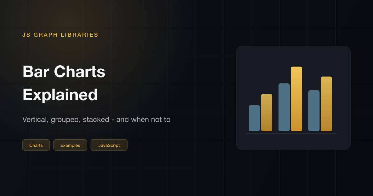
Bar charts explained in one line: a number becomes a length. That's the whole encoding. People read length faster and more accurately than they read a pie slice or a bubble or a 3D column — which is why bars end up being the right call for most comparison tasks, even when something fancier looks more interesting on a Dribbble post.
Below are the four layouts I actually ship — vertical, horizontal, grouped, stacked — plus the rules that stop a bar chart from quietly lying to the person reading it. If you just need the drawing code with no library, that's the canvas / SVG post. For every chart type in one scan, JavaScript chart examples.
What a bar chart is
One axis holds category names. The other axis holds amounts. Each bar represents one amount, and you compare them by reading their lengths. That's the whole contract. No secondary encoding, no context you have to infer from position in a circle.
A column chart is a bar chart that stands upright. Same encoding, same rules, different orientation. I call both of them bar charts. The interesting decisions aren't really about the term — they're about whether to flip it horizontally, group series, or stack them.
When a bar chart is the right chart
- Use bars when the x-axis is a set of categories: products, countries, weekdays as labels, survey answers.
- Use a line when the x-axis is continuous and the in-between matters — usually time.
- Skip the pie once you have more than a few slices, or when the point is ranking, not “share of a whole.”
If the “categories” are actually a flow, a sankey is clearer. If they're places, start from the map example.
Vertical bars
The default. Short labels, a handful of categories, one series. Hover a bar for the dummy page-view count. Baseline is zero, so Friday being almost twice Monday is something you can see, not something you have to believe.
Preview
Horizontal bars
I flip the chart when the labels are long or I want a ranking to read top to bottom. Same encoding: length is the value. The dummy scores below are “how fast can I get a bar on screen,” not a quality ranking.
Preview
Grouped bars
Two — maybe three — series in the same category, sitting side by side. This is how I compare this year to last year without stacking them into a total nobody actually asked for. Once you get past three series, the groups start looking like a fence and readers give up. That's the signal to split into small multiples instead.
Preview
Stacked bars
Stacked bars are a composition plus a total. The top of the stack is honest. The middle segments are not — they don't share a baseline, so you cannot compare “direct” across months by eye. I stack when the mix and the total both matter. I group when the comparison is the point.
Preview
Rules that keep it honest
- Start at zero. Truncating a bar axis is how 48 vs 52 becomes a visual emergency. The encoding is length — if you chop the baseline, the lengths are wrong. If you're trying to show a small change over time, switch to a line chart, where cropping the axis is more defensible.
- Fewer categories than you think you need. Somewhere past 10 bars, readers stop comparing and just look for the tallest one. Sort the chart, or break it into two.
- Sort on purpose. Rankings should be sorted by value. Time series and ordinal labels (Mon–Sun, Q1–Q4) should stay in their natural order. An alphabetical sort almost never helps the reader.
- No 3D, no cones, no drop shadows. All of that adds visual noise and distorts the one thing that matters: the length of the bar. Keep it flat.
- Label the number when it matters. A hover tooltip works well for most cases. Tiny labels jammed on tiny bars don't. Pick one approach and stay consistent.
One more thing: color is a highlighter, not a second data channel. One series, one fill color. Extra hues are for extra series — not for decoration.
How I'd draw one in JavaScript
The whole trick is a scale: value in, pixels out. Find a max, turn each number into a height, park a rectangle. The live charts on this page are that, plus hover. The snippet is the core without a library.
Code
const data = [
  { label: "Mon", value: 12 },
  { label: "Tue", value: 19 },
  { label: "Wed", value: 8 },
  { label: "Thu", value: 15 },
  { label: "Fri", value: 22 },
];

const width = 640;
const height = 240;
const pad = { left: 36, right: 12, top: 16, bottom: 36 };
const innerW = width - pad.left - pad.right;
const innerH = height - pad.top - pad.bottom;
const max = 24;
const slot = innerW / data.length;
const barW = slot * 0.55;

const svg = document.createElementNS("http://www.w3.org/2000/svg", "svg");
svg.setAttribute("viewBox", `0 0 ${width} ${height}`);

data.forEach((row, i) => {
  const barH = (row.value / max) * innerH;
  const x = pad.left + i * slot + (slot - barW) / 2;
  const y = pad.top + innerH - barH;
  const rect = document.createElementNS("http://www.w3.org/2000/svg", "rect");
  rect.setAttribute("x", x);
  rect.setAttribute("y", y);
  rect.setAttribute("width", barW);
  rect.setAttribute("height", barH);
  rect.setAttribute("rx", "4");
  rect.setAttribute("fill", "#e8b84a");
  svg.appendChild(rect);
});

document.querySelector("#chart").appendChild(svg);
That's enough for a status page. The moment you want a stacked group, a time axis, and a legend that isn't hand-drawn, install something.
| If you need | I'd use |
|---|---|
| A few bars, static data | SVG, like the snippet |
| Hover, stacked, mixed types | Chart.js |
| The same thing as React components | Recharts (BarChart example) |
| Custom layout, odd shapes | D3 (graph examples) |
Questions I get
What is a bar chart?
A chart that encodes a number as the length of a rectangle. One axis holds your categories, the other holds values. The whole point is that people can compare lengths at a glance — it's faster and more accurate than trying to judge area or slice angle.
When should I use a bar chart instead of a line chart?
If your categories are things you could reorder — countries, product names, survey answers, days of the week treated as labels — use bars. A line implies that the space between points means something, which is really only true when you're dealing with time or some other continuous scale. Connecting Tuesday and Thursday with a line suggests something happened in between. If that's not what you mean, use bars.
Should a bar chart always start at zero?
Yes, almost always. The encoding is length, and if you truncate the axis, you're distorting the lengths. A bar chart where 48 and 52 look like a cliff isn't showing data — it's making a point. Line charts have more flexibility here because the slope still carries meaning even when the axis is cropped. Bar charts generally don't.
What is the difference between grouped and stacked bars?
Grouped bars put series side by side so you can compare each one directly. Stacked bars pile them on top of each other to show a total. The problem with stacked bars is that only the bottom segment has a shared baseline — everything above it floats, so comparing individual segments across categories is really hard. I use stacked when both the total and the composition matter. If I just want to compare, I group.
How do I make a bar chart in JavaScript?
Find your max value, then map each value to a pixel height (or width for horizontal bars), draw a rectangle, add a label. That's it for the basics. SVG is fine for a few static bars. The moment you need hover tooltips, stacked bars, or a time axis that handles gaps, reach for Chart.js, Recharts (if you're in React), or D3 if the layout is custom.